March 11, 2011
CSS3 Transformations and Transitions for Algorithm Visualization
CSS3 offers some interesting new properties that could be used for algorithm visualization. Here, I’ll first introduce the new properties and then proceed to show and explain some demos that I’ve created. You can skip the nonsense and view the demos: bubble sortselection sort
CSS3 (or Cascading Stylesheets 3)
CSS3 includes several modules useful for web designers and web developers. Here, we are only interested in a couple: CSS Transforms, CSS Transitions, and CSS Animations. These are the modules that make it possible to add animation effects to web pages using CSS classes.
CSS Transforms CSS3 transforms allows translation, rotation, and scaling of elements in 2D and 3D. A two-dimensional transformation is applied to an element through the transform property. This property contains a list of transform functions. The transform-origin property establishes the origin of transformation for an element.
The transform functions in the specification are translate, scale, rotate, and skew. There are also versions of translate, scale, and skew to transform only X or Y dimension, that is, translateX and translateY, for example. Furthermore, the matrix transform functions allows for matrix transformations. Multiple transform functions can be used in a single transform property.
CSS Transitions The new CSS3 Transitions module defines CSS properties that can be used to change values of properties smoothly from one value to another over a specified duration. The transition behaviour is specified using a number of CSS properties.
transition-propertyspecifies the properties that are smoothly changed. All animatable properties (not all CSS properties can be transitioned) that have changed can be animated using the value ‘all’.transition-durationis used to specify the length of the transition andtransition-delaywhen the transition will start.transition-timing-functiondescribes the way the intermediate values are calculated. This allows a transition to change speed. There are several timing functions specified, for example, linear, ease-in, and ease-out.transitionproperty is a shorthand property that allows setting all of the above with one CSS property.
Listing below gives an example of how one would specify a transformation and a smooth transition.
#selected {
  transition-property: transform, background-color, opacity;
  transform: translate(200px) scale(0.6);
  background-color: yellow;
  opacity: 0.2;
}
The specified transformation would look like something in the picture below, assuming the original object had a red background and was not transparent.

CSS Animation The CSS3 Animations module includes features to enable more fine-grained animation. This includes properties like keyframes that enable composing more controlled transitions. The module is an extension of the Transitions module.
Algorithm Visualizations with CSS3
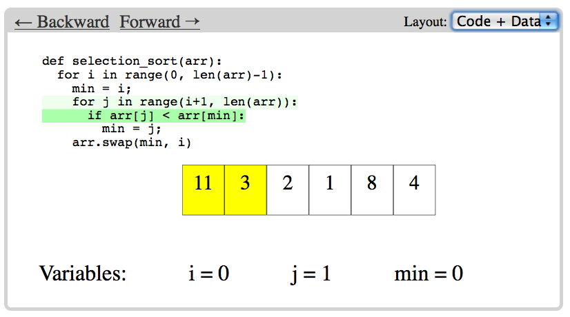
To test how the new CSS3 properties work for visualizing algorithms, I created a couple of demos of sorting algorithms. Check out the bubble sort and selection sort demos. You’ll need a browser that supports the new features, such as recent version of Chrome or Safari. If you don’t have such browser, go install one or see the picture below.

You can move backward and forward in the animation obviously using the links. When moving, the current codeline is highlighted, variable values updated, and the swaps of array elements animated. In addition to moving backward and forward, you can also change the layout to focus on the code or the data structure.
Technical Details
The animations are generated by an (ugly) Python script. This script is general enough that it would allow creation of animations of other sorting algorithms (or other algorithms working with arrays) by writing and annotating the python code. The code in the created animations is the actual Python code used to run the algorithm.
The Python code generates a JavaScript array of CSS class names as well as the corresponding CSS3 properties. An example of a highlight operation is shown below.
/* codeline highlight */
.css-line2-5 { background-color: #afa; }
/* array element highlight */
.css-elem2-5 { background-color: yellow; }
/* moving an array element */
.css-elem2-6 {
  -webkit-transform: translate(-102px,0);
  -moz-transform: translate(-102px,0);
  transform: translate(-102px,0);
}
When moving backward or forward in the animation, JavaScript updates the CSS class attributes of the codelines, variables, and array cells changed in the operation. The browser then animates the changes according to the CSS properties.
Conclusion
While the browser support for CSS3 transformations is improving, they still can’t be used for learning material that all students need to be able to access. But, they work well enough on some mobile browsers (such as iPhone and Android phones) to be useful when building AVs for mobile devices.